Gates: College Attendance Model Report
Project Overview
One of the projects I worked on while I was a graduate fellow at the Sorenson Impact Center was to predict the rate of total college going students in the future. These predictions are important because the rate of college going is thought by some to dramatically decrease in the upcoming decade or two. In this project, I worked as the primary data analsyt and used mixed modeling techniques to predict the total number of future students in a given state from 2020 - 2035. As a preview, our models were able to predict the total number of college students in a given state remarkably well for the last 4 years we had known data. However, although this model predicts an upcoming downward trend, it also predicts an unituitive relationship between birthrate and collge enrollment that may hinder our ability to trust the model's predictions.
Much thanks to Lily Bailey who was paramount to this project. She is an excellent coder and primarily helped with gathering, cleaning, and organizing the data used for these models.
Data
The two main sources of data for this model are from the Integrated Postsecondary Education Data System (IPEDS) and the National Bureau of Economic Research via the National Center for Health Statistics (NCHS). IPEDS is a system of interrelated surveys conducted annually by the U.S. Department of Education’s National Center for Education Statistics (NCES). IPEDS gathers information from every college, university, and technical and vocational institution that participates in the federal student financial aid programs (nces.ed.gov/ipeds). In this dataset there is information for the years 2008-2017 for each school surveyed including school type, total enrolled students, first time full time students, and school location.
We are using a subset of the total IPEDS data, only retaining degree granting institutions. We are also only including institutions for which we have a full year set of data from 2008-2017, which removes 448 out of 3858 institutions from the dataset. Additionally, we were missing state data for 174 institutions which we also ommitted for the model. Each of these data omissions can be seen in the following two tables. The first shows the total number of institutions we had data on for 1-10 years (10 being the maximum and representing full data). The second shows how many institutions had missing State information in our dataset.
The birth rate data comes from the NCES in a variety of forms. For 1988-2004, the data comes as a table with every row being a different, unique individual born in the USA during that year. We grouped by state of occurence and counted the number of individuals born for each year and for each state.
Overview of Data:
Here we show some descriptive plots and summaries about the final data set used for the models below. First is a plot of the number of institutions per state. California has the largest number of institutions represented in the data set whereas Alaska has the least.
#Counts of institutions by state
df.total. %>%
  filter(count == 10) %>%
  select(UNITID, State) %>%
  unique() %>%
  group_by(State) %>%
  count() %>%  ungroup() %>%
  filter(is.na(State) == FALSE) %>%
  ggplot(aes(x = reorder(State,n), y = n, fill = State)) +
      geom_bar(stat = "identity") + ggtitle("Number of Institutions by State") +
      xlab("") + ylab("Number of Institutions") +
      theme_minimal() +
      theme(axis.text.x = element_text(angle = 90, hjust = 1, face = "bold")) +
      guides(fill = FALSE)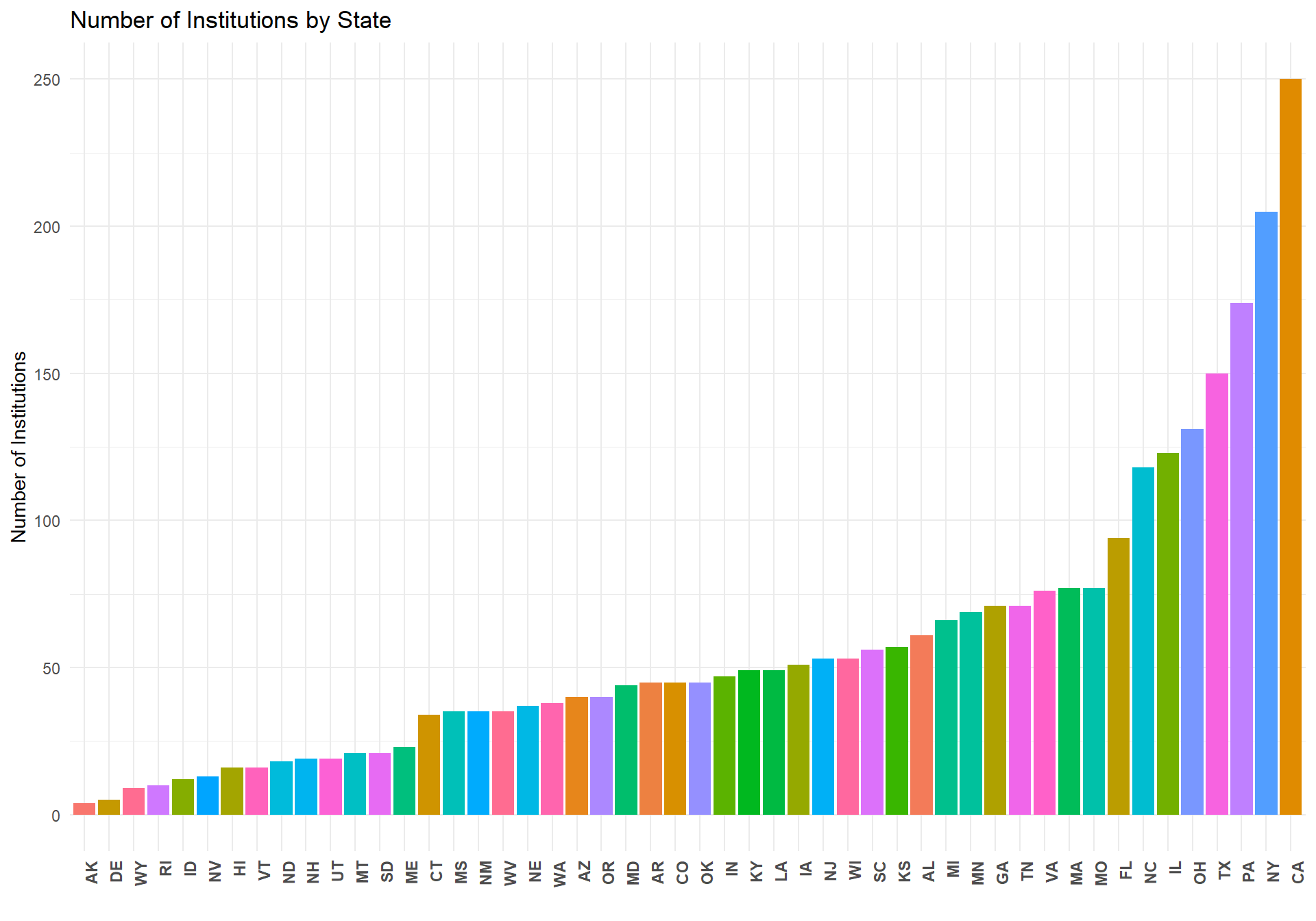
#Count of insitutions by institution type
df.total. %>%
  filter(count == 10) %>%
  select(Level) %>%
  group_by(Level) %>%
  count() %>%  ungroup() %>%
  filter(is.na(Level) == FALSE) %>%
  ggplot(aes(x = reorder(Level,n), y = n, fill = Level)) +
      geom_bar(stat = "identity") + ggtitle("Number of Institutions by Institution Type") +
      xlab("") + ylab("Number of Institutions") +
      theme_minimal() +
      theme(axis.text.x = element_text(angle = 0, hjust = 1, face = "bold")) +
      guides(fill = FALSE)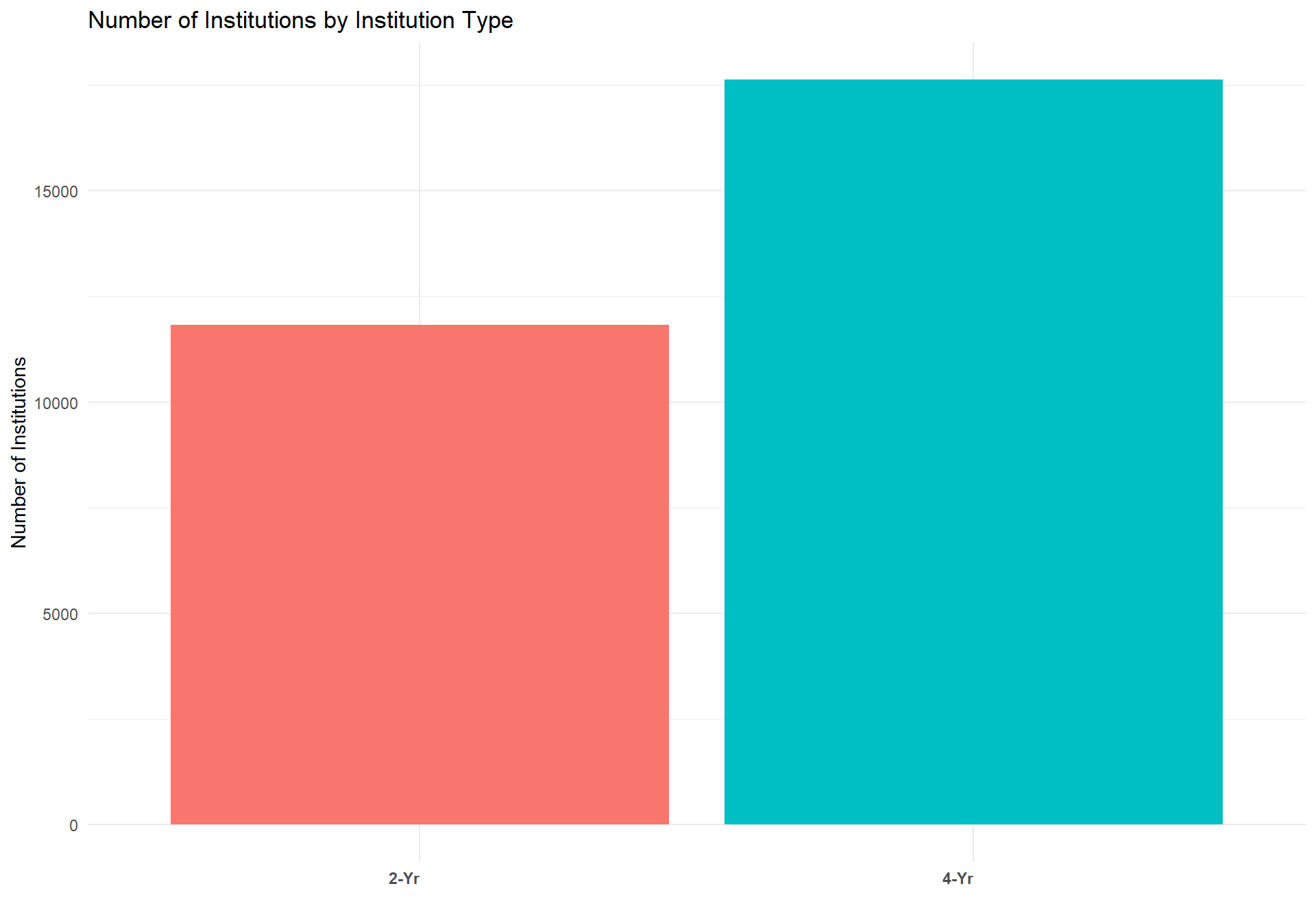
Below is the final version of the data we used for each of the models reported below. Our two main outcome variables are "TS_st" and "FTFT_sum", which represent the total students and total first time (full time) students enrolled in a given state for each institution type (2-Year, 4-Year, National 4-YR, and Elite 4-Year) during the years 2008 - 2017, respectively. Our two main predictor variables are "count_t18_gc" and "Inst_Type". count_t18 represents the birthrate count for a given state 18 years prior to the year that the total and first time student counts were recorded. To reduce any potential multicolineraity and to provide the model with a more appropriate scale, we grand centered (count - mean(count_t18)) count_t18 and then z-scored the grand centered values.
#Wrap up full dataset by state & filter out any data that does not have complete data
df.total_st <- df.total. %>%
  filter(count == 10) %>%
  select(State, totalstudents, FTFT, Year, Level, count_t18_gc) %>%
  group_by(State, Year,Level) %>%
  mutate(TS_st = sum(totalstudents, na.rm = TRUE), FTFT_sum = sum(FTFT, na.rm = TRUE)) %>% ungroup() %>%
  select(-c(totalstudents, FTFT)) %>%
  unique() %>%
  mutate(Inst_Type = factor(Level))

head(df.total_st)
## # A tibble: 6 x 7
## State Year Level count_t18_gc[,1] TS_st FTFT_sum Inst_Type
## <chr> <dbl> <chr> <dbl> <dbl> <dbl> <fct>
## 1 AL 2008 4-Yr -0.177 176647 23832 4-Yr
## 2 AL 2009 4-Yr -0.184 184589 22712 4-Yr
## 3 AL 2010 4-Yr -0.189 193068 22992 4-Yr
## 4 AL 2011 4-Yr -0.191 189442 22580 4-Yr
## 5 AL 2012 4-Yr -0.200 187450 24045 4-Yr
## 6 AL 2013 4-Yr -0.207 185528 24871 4-YrOutcome variable analysis
Before running any statistical analysis on our data, it was first necessary to assess the distribution of our outcome variables (TS_st & FTFT_sum). This is required because regression analysis carries with it assumptions about both the structure of your data and the distribution of your outcomes. Normal OLS regression assumes that your outcome variable(s) are normally distributed. If the outcome variable(s) are not normally distributed, then alternative regression methods are required for better model fit, and better theoretical assumptions about your data. Below are two histograms that describe the distribution of our two outcome variables. As can be seen below, TS_st is not normally distributed. If it were, the bars would roughly match the curve of the black line.
#Total students hist
TS <- df.total_st$TS_st
h <- hist(TS, breaks = 10, density = 10,
          col = "lightgray", xlab = "Total Students", main = "Histogram of Total Students")
xfit <- seq(min(TS), max(TS), length = 40)
yfit <- dnorm(xfit, mean = mean(TS), sd = sd(TS))
yfit <- yfit * diff(h$mids[1:2]) * length(TS)

lines(xfit, yfit, col = "black", lwd = 2)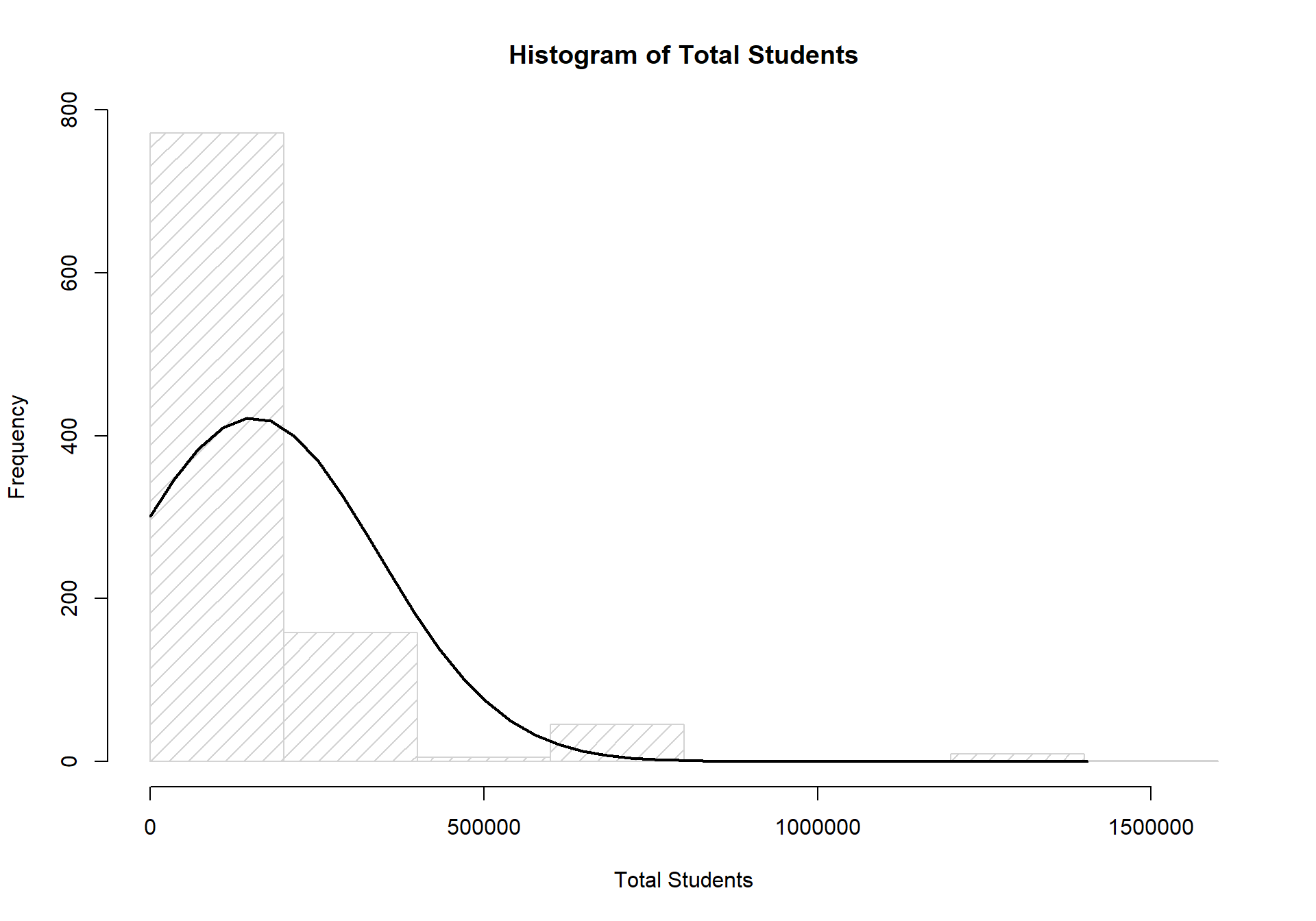
#Total first time full time hist
FTFT <- df.total_st$FTFT_sum
h <- hist(FTFT, breaks = 10, density = 10,
          col = "lightgray", xlab = "Total First Time Full Time Students", main = "Histogram of FTFT Students")
xfit <- seq(min(FTFT), max(FTFT), length = 40)
yfit <- dnorm(xfit, mean = mean(FTFT), sd = sd(FTFT))
yfit <- yfit * diff(h$mids[1:2]) * length(FTFT)

lines(xfit, yfit, col = "black", lwd = 2)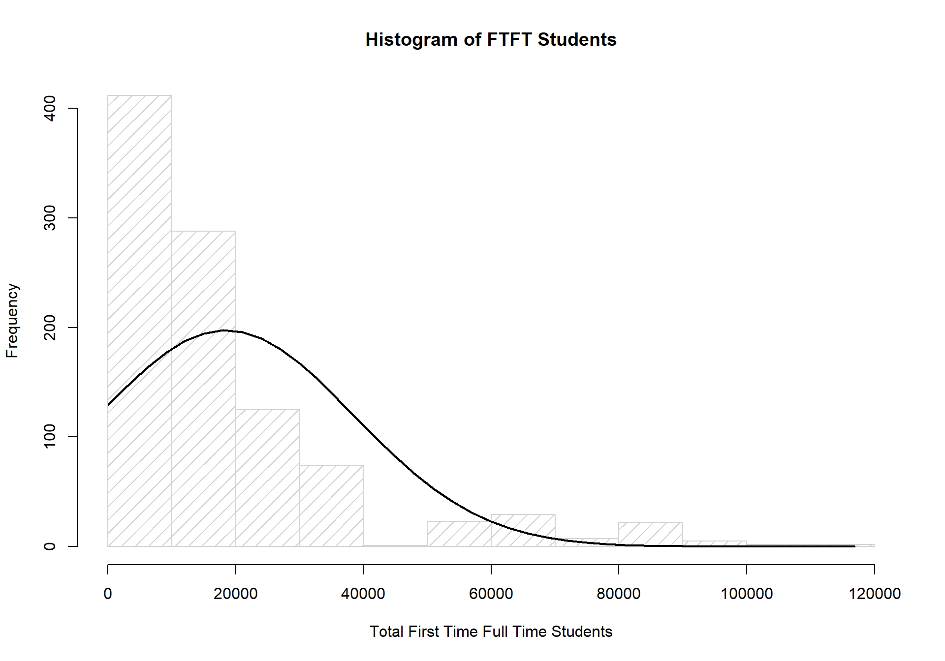
As with our total student counts, the counts for first time (full time) students is also drastically different from a normally distributed set of data.
Given the non-normality of both of our outcome variables, it is appropriate to shift the assumption of our distributions from a normal distribution to a poisson distribution. Poisson distributions assume that values are in a count format, values cannot be negative, and that the majority of the data is skewed towards 0. Our data matches each of these assumptions well, and is the reason why we have chosen to run generalized linear models with the assumption of a poisson distribution. Further details on the poisson's log link function will be described in the following sections.
Total Students Model
First, we report our full total students model that attempts to predict the total number of college going students in a given state and for a given institution type between the years 2008-2013. We chose to 'train' the model on the years of 2008-2013 simply because we wanted a balance between having enough data for the model and enough remaining data to compare the model's predictions with actual enrollment counts.
#Create data used for Models
df.model_st <- df.total_st %>%
  filter(Year < 2014 & is.na(State) == FALSE)

#Create data used for model performance evaluation
df.future_st <- df.total_st %>%
  filter(Year >= 2014 & is.na(State) == FALSE)
The model below is known as a generalized mixed model (AKA Hierarchical Generalized Linear Model or linear mixed effects regression). Mixed models are similar to regular OLS regression, but they allow modelers to account for the nested structure of data through random intercepts, and they allow modelers to free up the estimation of a predictors effect based on the nested grouping structure. In our case, we ran a 2-level model. The first level is the observation level (i.e., at the level of individual rows), and the second level is at the state level. By including the state level, it allows the model to estimate different intercepts for each state, and as will be shown, different estimates of the effects for each predictor that is included in the model.
1. Full Model: Total Students
The model below includes two main predictors: the z-scored grand centered birthrate counts 18 years prior to the year the total students count was recorded, and institution type, which has 4 seperate levels. We chose to have birth rates interact with insitution type because enrollment between different institution types is likely not as dependent on our estimate of the number of 18 year olds in that state. Furthermore, we allowed the model to freely estimate the individual effects of birth rate 18 years prior and institution type on total student enrollment for each state.
library(lme4) #Package required to run lmer functions

#Run full model on total students
  #glmer is used for generalized lmer models
  #second line specifies the random effect structure.  Can be read roughly ~ I want these things to the left of "|" to vary by this/these things on the right of "|"
  # 1 indicates intercept
  # family specifies the distribution of the DV and the link specifies how the data should be tranformed.
  # control options are used to increase the number of iterations allowed before reporting any convergence failures.
m_full <- glmer(TS_st ~ count_t18_gc*Inst_Type +
                          (1 + count_t18_gc + Inst_Type | State),
                        data = df.model_st,
                        family = poisson(link = "log"),
                        control=glmerControl(optCtrl=list(maxfun=3e5)))
summary(m_full)
## Generalized linear mixed model fit by maximum likelihood (Laplace
## Approximation) [glmerMod]
## Family: poisson ( log )
## Formula: TS_st ~ count_t18_gc * Inst_Type + (1 + count_t18_gc + Inst_Type |
## State)
## Data: df.model_st
## Control: glmerControl(optCtrl = list(maxfun = 3e+05))
##
## AIC BIC logLik deviance df.resid
## 281101.8 281145.7 -140540.9 281081.8 584
##
## Scaled residuals:
## Min 1Q Median 3Q Max
## -120.613 -7.387 0.760 7.838 190.344
##
## Random effects:
## Groups Name Variance Std.Dev. Corr
## State (Intercept) 22.4836 4.7417
## count_t18_gc 36.4402 6.0366 0.86
## Inst_Type4-Yr 0.7571 0.8701 -0.48 -0.38
## Number of obs: 594, groups: State, 50
##
## Fixed effects:
## Estimate Std. Error z value Pr(>|z|)
## (Intercept) 9.803992 0.655638 14.953 < 2e-16 ***
## count_t18_gc -2.080517 0.830269 -2.506 0.0122 *
## Inst_Type4-Yr 0.758632 0.123520 6.142 8.16e-10 ***
## count_t18_gc:Inst_Type4-Yr -0.276314 0.002346 -117.773 < 2e-16 ***
## ---
## Signif. codes: 0 '***' 0.001 '**' 0.01 '*' 0.05 '.' 0.1 ' ' 1
##
## Correlation of Fixed Effects:
## (Intr) cn_18_ I_T4-Y
## cont_t18_gc 0.854
## Inst_Typ4-Y -0.474 -0.364
## c_18_:I_T4- 0.000 -0.002 0.000Above is a summary of the model results, which are shown for readers who are interested in the final estimates of the effects of birth rate and institution type on the total student enrollment. Notably, the coefficients reported here and in the subsequent models are in log form, because the poisson general linear model uses a log link function to fit predictor values to outcome values.
To demonstrate to readers what the random intercept and random effects do, we provide the following table, which shows the estimated rand intercepts and effects for each state.
#Call effect estimates for each state of the full model
coefs <- coef(m_full)$State
#Output only those that are actually randomeffects
coefs[2:3]
## count_t18_gc Inst_Type4-Yr
## AK 0.07382691 0.641475154
## AL -0.14684259 0.662203532
## AR -5.20888762 0.460992069
## AZ 1.22555936 -1.099728920
## CA 0.16642585 0.890196076
## CO 9.56349299 0.428914666
## CT -1.24759022 0.403562886
## DE -19.24659908 4.216150516
## FL -1.19499598 3.172278908
## GA -4.98114022 0.721334085
## HI -2.65622045 0.306974144
## IA 0.94952161 0.090858788
## ID 16.24444920 1.329897175
## IL 0.68435699 0.173394078
## IN -9.85739063 1.430248861
## KS -2.76479187 0.275166073
## KY -1.13481122 0.408695024
## LA -0.68968901 0.819225706
## MA -0.48594748 0.682184286
## MD -0.87137700 0.018507107
## ME -1.86899014 0.690609233
## MI 0.25744481 0.533423630
## MN -1.77177291 0.481810800
## MO -2.73093669 1.068746907
## MS -2.19188526 -0.002266906
## MT -22.42745746 1.317362045
## NC -1.23236392 -0.005050258
## ND -8.57462898 1.750426471
## NE -4.32258711 0.481698845
## NH -10.00242697 1.085313285
## NJ -0.06952854 0.094909748
## NM 7.16959716 -0.327385833
## NV -1.94136856 1.687113709
## NY -0.03177371 1.288736229
## OH -0.07502320 0.839422152
## OK -1.29125067 0.408216002
## OR -6.95925457 -0.188808179
## PA 0.17238013 1.052246404
## RI 1.01304572 0.981671793
## SC -0.60886520 0.089730787
## SD -5.90032105 1.836361327
## TN -6.08319976 0.515083489
## TX 2.66926658 0.620182473
## UT 2.63664005 1.268760854
## VA -2.08206918 0.235679926
## VT 0.24385586 1.380377830
## WA 1.14900637 1.094233048
## WI 0.11789081 0.888102221
## WV -14.53891186 1.607014768
## WY -3.17104368 -0.875112999To assess this model's performance on total student enrollment from 2014-2017, we use the 'predict()' function, which is normally meant for OLS regression, but is modified by the 'lme4' package to work with mixed models. Additionally, we exponentiate the predicted values because they are still in log form, which is the appropriate way to trasnform poisson glm predictions back to the raw metric of the data (i.e., counts of total students) (Raudenbush & Bryk, 2002).
#Plot predicted vs. actual
m_full_pred <- df.future_st %>%
  mutate(m_full_predvals = exp(predict(m_full, newdata = df.future_st, allow.new.levels = TRUE,
                                    re.form = ~(1 + count_t18_gc + Inst_Type| State)))) %>%
  mutate(m_full_error = m_full_predvals - TS_st)


m_full_plot <- m_full_pred %>%
  ggplot(aes(x = TS_st, y = m_full_predvals, color = Inst_Type)) + geom_point() +
  geom_abline(intercept = 0, slope = 1) +
  ggtitle("Predicted Vs. Observed: Birthrate & Institution Type, Full Model, All RE's") +
  theme_minimal() + ylab("Predicted Total Enrollment") + xlab("Actual Total Enrollment") +
  scale_y_continuous(limits = c(0,1.5e6)) +
  facet_wrap(~Year)
m_full_plot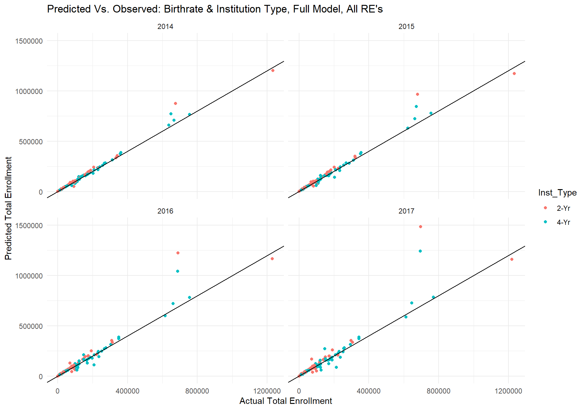
The plots above show the predicted values from the model for each year for a given institution type in a given state on the y-axis and the actual total enrollment for that year on the x-axis. The black line has an intercept of 0 and slope of 1, which would indicate perfect fit between the predicted and actual values. Though the scale of this plot is quite large and the absolute value of errors is difficult to see, the model seems to be doing fairly well. The overall correlation between the predicted values and observed data is...
corr <- cor(m_full_pred$m_full_predvals, m_full_pred$TS_st)
corr
## [1] 0.9594161However, one can also see that there are a few predictions that stray far away from the perfect fit line. Upon inspection of the data, we found that the largest discrepencies between the predicted and actual data were for the state of Texas. In fact, the reason for the warning message is because the predicted total enrollment in Texas for 2-Yr insitutions in 2017 was higher than the limit placed on the y-axis. Below is a plot of the average residual error for each state across year and insitution type.
m_full_plot_error <- m_full_pred %>%
  select(State, m_full_error) %>%
  group_by(State) %>%
  mutate(mean_error = mean(m_full_error)) %>%
  select(-c(m_full_error)) %>%
  unique() %>%
    ggplot(aes(x = reorder(State,mean_error), y = mean_error, color = State)) + geom_point(size = 3) +
      ggtitle("Mean Model Error for each State across Institution Type and Year") +
      xlab("") + ylab("Mean Error (predicted - observed)") +
      theme_minimal() +
      theme(axis.text.x = element_text(angle = 90, hjust = 1, face = "bold")) +
      guides(color = FALSE)
m_full_plot_error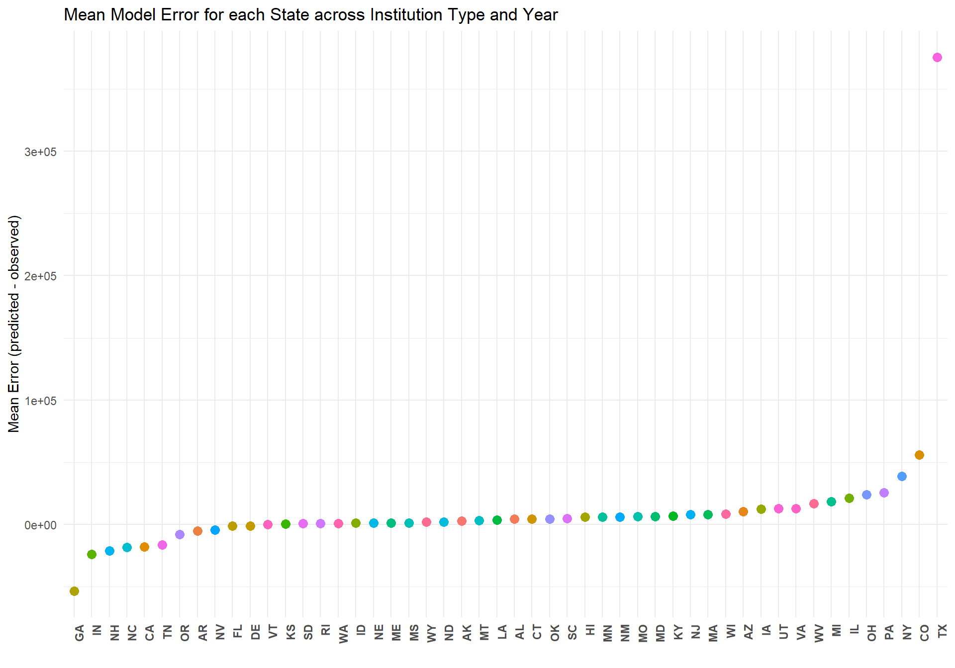
The above plot makes clear just how poorly this model estimates the total enrollment in Texas across all years and insitution types. To investigate why the model performs so poorly for Texas, we looked into the relationship between birthrate in Texas and total student enrollment.
TX <- df.total_st %>%
filter(State == "TX" & Inst_Type == "2-Yr" | State == "TX" & Inst_Type == "4-Yr") %>%
select(Year, TS_st, count_t18_gc, Inst_Type) %>%
group_by(Year, Inst_Type) %>%
mutate(totalstudents = sum(TS_st)) %>%
select(-c(TS_st)) %>% unique() %>%
mutate(Time = as.factor(ifelse(Year < 2014, "2008-2013", "2014 - 2017"))) %>%
ggplot(aes(x = count_t18_gc, y = totalstudents, color = Time, shape = Inst_Type)) +
scale_shape_manual(values=c(1,6))+
scale_colour_manual(values=c("black", "blue"))+
theme_minimal() +
geom_point(size = 3) + ylab("Total Students Enrolled") + xlab("Birth Counts 18 Years Prior(z-scored)")
TX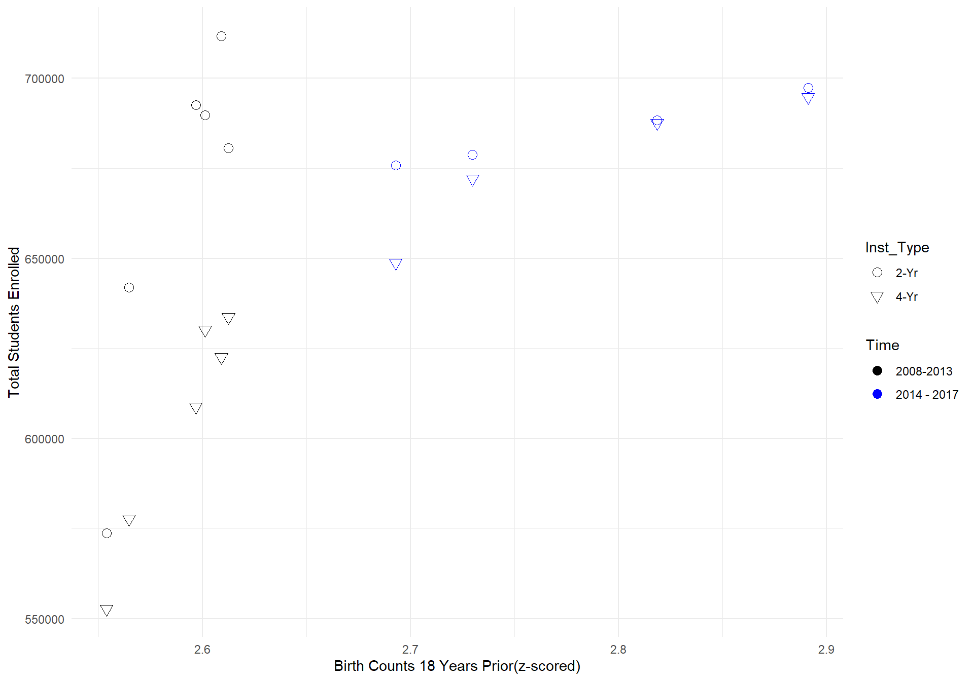 What can be seen from the graph above is that the relationship between birth rate counts 18 years prior and total student enrollment counts in Texas is far steeper from 2008-2013 compared to 2014-2017. Since we allowed the model to estimate the effect of birth counts seperately for each state, the model would in this case predict that the relationship between birth counts and total students to continue on its steep projection, which is why the model drastically overshoots the actual data.
To account for this oddity, we ran the model again, but without the random effect of birth rate counts. Therefore, the model below is no longer free to estimate the effect of birth rate counts on total student enrollment for each state and will instead only estimate a fixed effect of birth rate counts on total student enrollment for all states.
2. Reduced Model: Total Students with no random effect of birth counts
We begin first with the summary of the reduced model's output.
m_2 <- glmer(TS_st ~ count_t18_gc*Inst_Type +
                  (1 + Inst_Type | State),
                data = df.model_st,
                family = poisson(link = "log"),
                control=glmerControl(optCtrl=list(maxfun=3e5)))

summary(m_2)
## Generalized linear mixed model fit by maximum likelihood (Laplace
## Approximation) [glmerMod]
## Family: poisson ( log )
## Formula: TS_st ~ count_t18_gc * Inst_Type + (1 + Inst_Type | State)
## Data: df.model_st
## Control: glmerControl(optCtrl = list(maxfun = 3e+05))
##
## AIC BIC logLik deviance df.resid
## 399103.6 399134.3 -199544.8 399089.6 587
##
## Scaled residuals:
## Min 1Q Median 3Q Max
## -136.155 -7.769 2.044 9.455 242.971
##
## Random effects:
## Groups Name Variance Std.Dev. Corr
## State (Intercept) 1.7510 1.3233
## Inst_Type4-Yr 0.7647 0.8745 -0.63
## Number of obs: 594, groups: State, 50
##
## Fixed effects:
## Estimate Std. Error z value Pr(>|z|)
## (Intercept) 10.970924 0.187946 58.373 < 2e-16 ***
## count_t18_gc 0.158248 0.001455 108.747 < 2e-16 ***
## Inst_Type4-Yr 0.761584 0.124974 6.094 1.1e-09 ***
## count_t18_gc:Inst_Type4-Yr -0.330543 0.002285 -144.650 < 2e-16 ***
## ---
## Signif. codes: 0 '***' 0.001 '**' 0.01 '*' 0.05 '.' 0.1 ' ' 1
##
## Correlation of Fixed Effects:
## (Intr) cn_18_ I_T4-Y
## cont_t18_gc 0.000
## Inst_Typ4-Y -0.637 0.000
## c_18_:I_T4- 0.000 -0.637 0.000
## convergence code: 0
## Model is nearly unidentifiable: very large eigenvalue
## - Rescale variables?Next, we provide plots of the predicted versus actual data for the reduced model.
#Plot predicted versus actual
m_2_pred <- df.future_st %>%
mutate(m_2_predvals = exp(predict(m_2, newdata = df.future_st, allow.new.levels = TRUE,
re.form = ~(1 + Inst_Type| State)))) %>%
mutate(m_2_error = m_2_predvals - TS_st)
m_2_plot <- m_2_pred %>%
ggplot(aes(x = TS_st, y = m_2_predvals, color = Inst_Type)) + geom_point() + geom_abline(intercept = 0, slope = 1) +
ggtitle("Predicted Vs. Observed: Birthrate & Institution Type, Reduced Model, Only Inst. Type RE") + theme_minimal() + ylab("Predicted Total Enrollment") + xlab("Actual Total Enrollment") +
scale_y_continuous(limits = c(0,1.5e6)) +
facet_wrap(~Year)
m_2_plot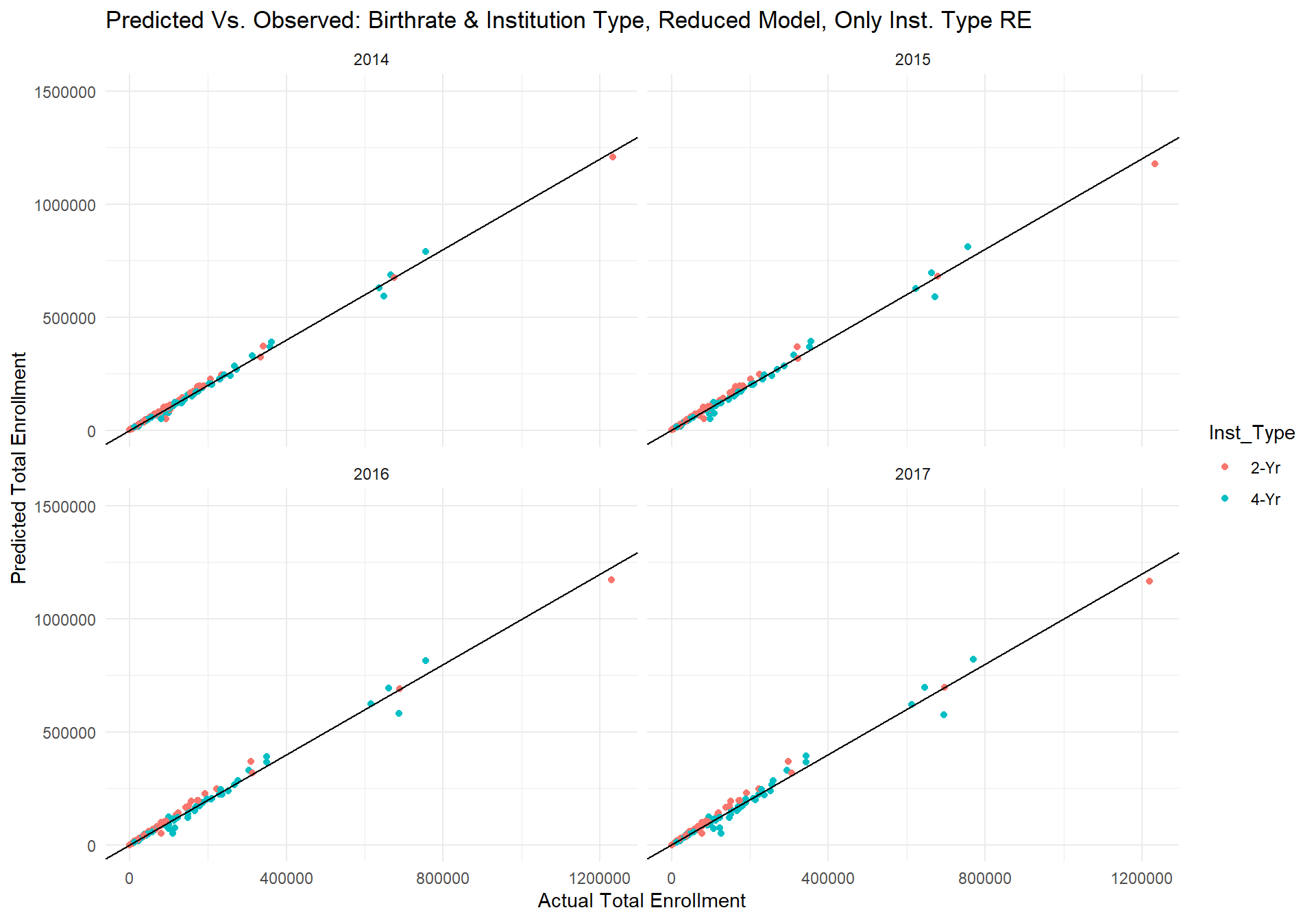 As can be seen by the plots above, the reduced model's predictions no longer have any seemingly drastic outlier predictions. If we produce the same plot of actual errors by state again but with the reduced model's predictions, we get the following graph.
m_2_plot_error <- m_2_pred %>%
select(State, m_2_error) %>%
group_by(State) %>%
mutate(mean_error = mean(m_2_error)) %>%
select(-c(m_2_error)) %>%
unique() %>%
ggplot(aes(x = reorder(State,mean_error), y = mean_error, color = State)) + geom_point(size = 3) +
ggtitle("Mean Model Error for each State across Institution Type and Year") +
xlab("") + ylab("Mean Error (predicted - observed)") +
theme_minimal() +
theme(axis.text.x = element_text(angle = 90, hjust = 1, face = "bold")) +
guides(color = FALSE)
m_2_plot_error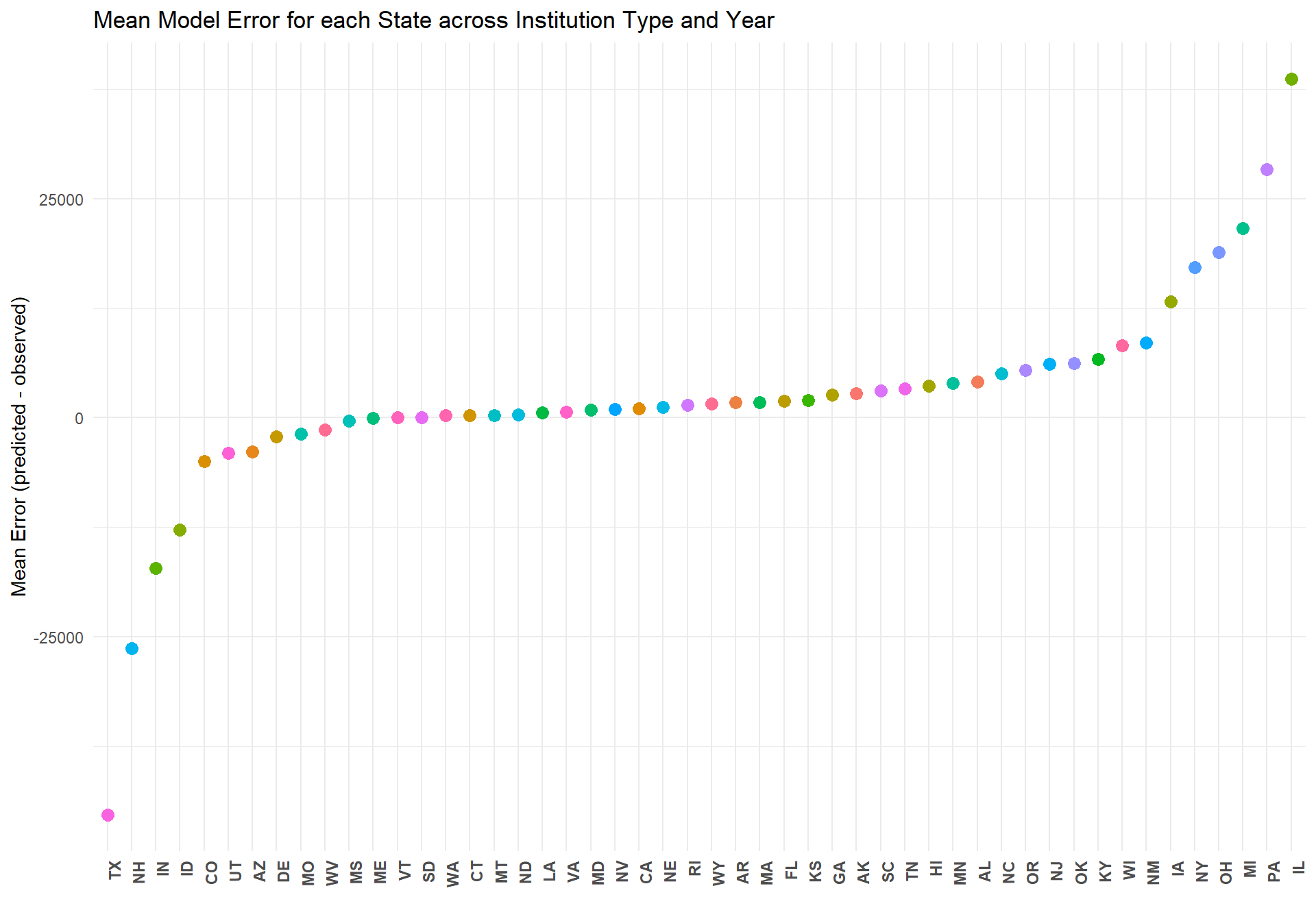 Interestingly, predictions for Texas have now become the most underestimated, but relative to the previous full model, the predictions are now all within 25,000 students of the actual total student enrollment. In fact, for 41 out of the 50 states, the reduced model's predictions are off by less than 5000 students.
If we compare the two models' errors as a ratio of the actual data, the following plot is produced.
m_compare_full_m2 <- m_full_pred %>% #density plot
left_join(m_2_pred %>% select(Year,State,Inst_Type,m_2_predvals,m_2_error)) %>%
select(Year, State, m_full_predvals, m_2_predvals,TS_st) %>%
gather(m_full_predvals, m_2_predvals, key = "model", value = "prediction") %>%
mutate(error_ratio = (prediction - TS_st)/TS_st) %>%
ggplot(aes(x = error_ratio, fill = model, color = model, alpha = 0.2)) +
geom_density() + geom_vline(aes(group = model, xintercept=0)) +
ggtitle("Total Student Error Ratios: Full Model vs. Reduced Model") + xlab("Error as a Ratio of Actual Enrollment Count") +
scale_x_continuous(limits = c(-0.8,0.8)) + theme_minimal() +
scale_fill_manual(values = c("blue", "yellow")) +
scale_colour_manual(values = c("white", "black")) +
theme(legend.position = "none")
m_compare_full_m2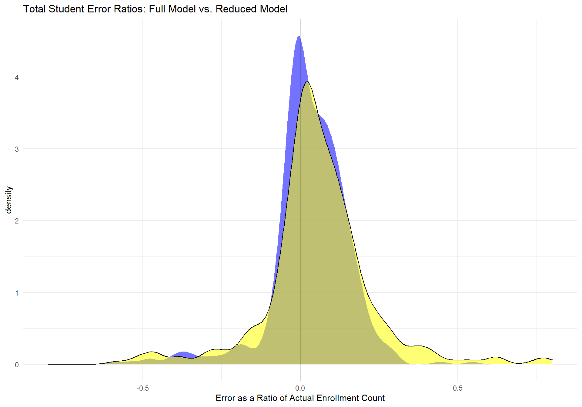 The yellow area represents the full model's distribution of error ratios and the blue distribution represents the reduced model's distribution of error ratios. The vertical line represents a ratio of 0, which would indicate a perfect prediction compared to the actual data. This graph clearly shows that the reduced model is performing much better than the full model, as its distribution is more tightly shaped around the perfect fit line. Below is a table of more descriptive statistics about the reduced model's performance.
#Descriptives on reduced model
RedMod_desc <- as.data.frame(cor(m_2_pred$m_2_predvals, m_2_pred$TS_st))

options(scipen = 999)
RedMod_desc %>%
  rename(PredVsActual_Correlation = `cor(m_2_pred$m_2_predvals, m_2_pred$TS_st)`) %>%
  mutate(min_error =  min(m_2_pred$m_2_error),
         median_error =  median(m_2_pred$m_2_error),
         mean_error = mean(m_2_pred$m_2_error),
         max_error = max(m_2_pred$m_2_error),
         percent_error = sum(abs(m_2_pred$m_2_error))/sum(m_2_pred$TS_st)) %>%
  gather(1:6, key = "Fit Index", value = "Value")
## Fit Index Value
## 1 PredVsActual_Correlation 0.99476887
## 2 min_error -121040.93293219
## 3 median_error 1284.66471185
## 4 mean_error 2088.77577837
## 5 max_error 72206.36832133
## 6 percent_error 0.07236021Based on the above graphs and fit indices, it is clear that the reduced model is performing extremely well. The correlation between the predicted and actual values, across year and institution type, is 0.996. At its worst, the Reduced Model underestimates college enrollment by about 116,069 students and overestimates college enrollment by about 72,806. However, on average the model is off by only about 480 students, which is somewhat exaggerated due to a positive skew indicated by the fact that the median error rate is about a 42 student underestimation.
Currently, we consider this 'Reduced Model' as our best predictor of future college enrollment.
Model Predictions
Since data exists on birth rates 18 years before college enrollment counts far into the future, we can use this model to predict the total amount of students for a given state and insitution type from 2018 - 2035. The plot below shows the current model's predictions for the total college enrollment counts for the years 2018 - 2035.
#All years
df.future_st_allYears <- df.future_st %>%
  select(State, Inst_Type) %>%
  unique() %>%
  left_join(birthdata)

birthplot <- birthdata %>%
  select(Year, count_t18) %>%
  group_by(Year) %>%
  mutate(TotalBirths = sum(count_t18)) %>%
  select(-c(count_t18)) %>%
  unique() %>%
  mutate(modelyears = ifelse(Year-18 < 2000, "Known Enrollment", "Unknown Enrollment")) %>%
  ggplot(aes(x = Year-18, y = TotalBirths, color = modelyears)) + geom_point() + geom_line() +
  ggtitle("Births 18 Years Prior by Year") + theme_minimal() + ylab("Total Births") + xlab("") +
  scale_x_continuous(breaks = seq(1990,2017,1), limits =c(1990,2017)) +
  theme(axis.text.x = element_text(angle = 70, hjust = 1, face = "bold"))

AllYearsPred <- df.future_st_allYears %>%
  mutate(AllYearsPredVals = exp(predict(m_2, newdata = df.future_st_allYears, allow.new.levels = TRUE,
                                       re.form = ~(1 + Inst_Type| State))))
AllYearsPredPlot <- AllYearsPred %>%
  group_by(Year, Inst_Type) %>%
  mutate(TotalEnrollment_pred = sum(AllYearsPredVals)) %>%
  select(Year, Inst_Type, TotalEnrollment_pred) %>%
  unique() %>%
  mutate(modelyears = ifelse(Year < 2018, "Known Enrollment", "Unknown Enrollment")) %>%
  filter(Inst_Type == "4-Yr") %>%
  ggplot(aes(x = Year, y = TotalEnrollment_pred, color = modelyears)) + geom_point() + geom_line() +
  ggtitle("Predicted Total Enrollment: 2008 - 2035") + theme_minimal() + ylab("Predicted Total Enrollment") + xlab("") +
  scale_x_continuous(breaks = seq(2008,2035,1), limits =c(2008,2035)) +
  theme(axis.text.x = element_text(angle = 70, hjust = 1, face = "bold"))


ggarrange(birthplot,AllYearsPredPlot, ncol = 1, nrow = 2)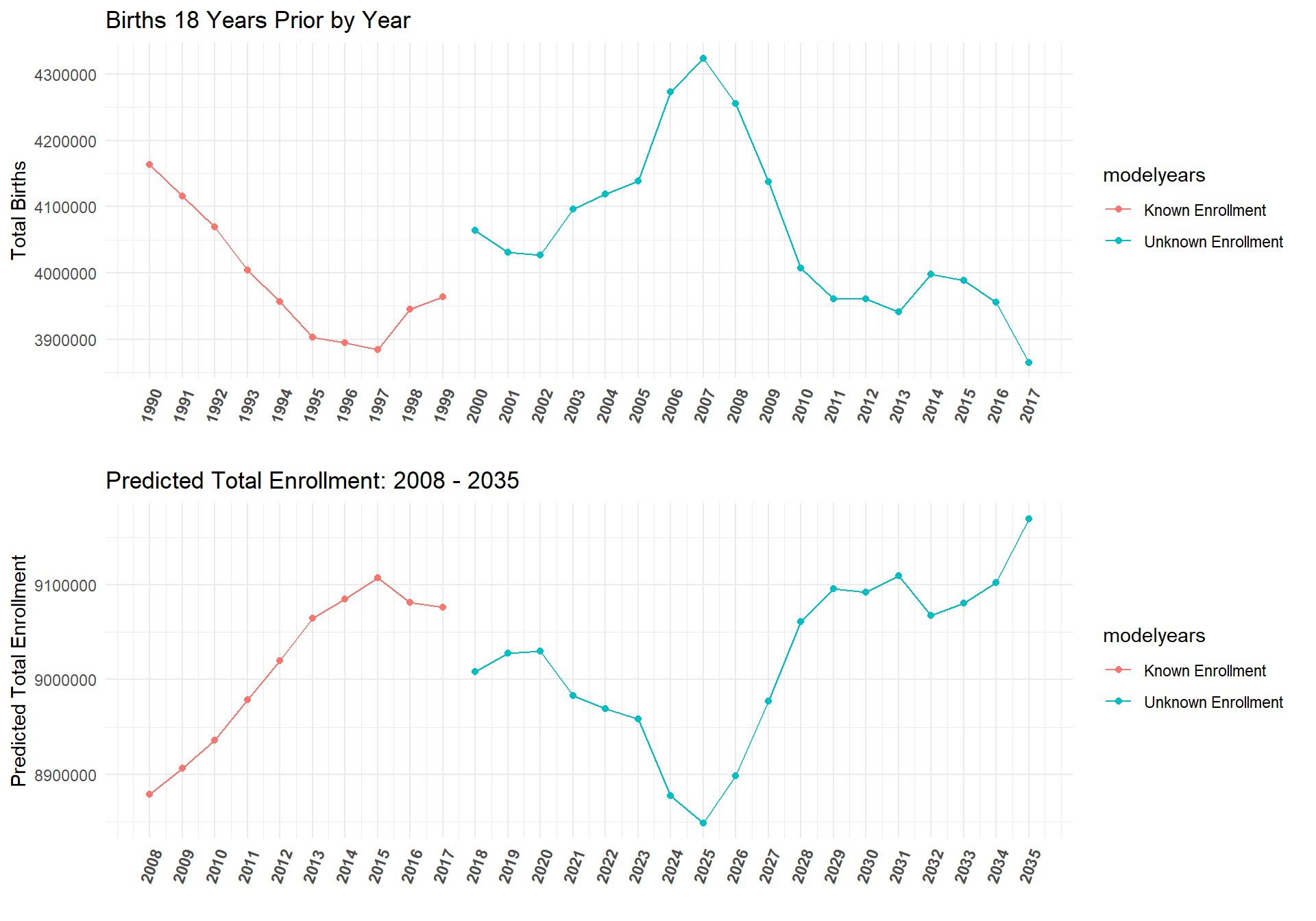
First Time Full Time Students
Given that our model above performed well for total student estimates, we investigate if the same model could also predict the total number of first time (full time) students. We expected that this would be the case because the correlation between first time student and total student counts were quite similar (0.96).
cor(df.total_st$TS_st, df.total_st$FTFT_sum)## [1] 0.9436139Reduced Model: First Time Full Time Students
Here the same Reduced Model is applied to first time (full time) student counts between the years of 2008 - 2013. The results are shown below. (Note: we did run the model with all random effects included, but as with our other full model on total students, Texas was drastically overestimated).
m.FTFT <- glmer(FTFT_sum ~ count_t18_gc*Inst_Type +
                  (1 + Inst_Type | State),
                data = df.model_st,
                family = poisson(link = "log"),
                control=glmerControl(optCtrl=list(maxfun=3e5)))

summary(m.FTFT)
## Generalized linear mixed model fit by maximum likelihood (Laplace
## Approximation) [glmerMod]
## Family: poisson ( log )
## Formula: FTFT_sum ~ count_t18_gc * Inst_Type + (1 + Inst_Type | State)
## Data: df.model_st
## Control: glmerControl(optCtrl = list(maxfun = 300000))
##
## AIC BIC logLik deviance df.resid
## 58724.2 58754.9 -29355.1 58710.2 587
##
## Scaled residuals:
## Min 1Q Median 3Q Max
## -40.183 -3.896 0.012 3.916 77.924
##
## Random effects:
## Groups Name Variance Std.Dev. Corr
## State (Intercept) 1.1408 1.0681
## Inst_Type4-Yr 0.8034 0.8963 -0.51
## Number of obs: 594, groups: State, 50
##
## Fixed effects:
## Estimate Std. Error z value Pr(>|z|)
## (Intercept) 8.879284 0.152066 58.391 < 0.0000000000000002
## count_t18_gc 0.433735 0.005120 84.719 < 0.0000000000000002
## Inst_Type4-Yr 0.784596 0.127973 6.131 0.000000000874
## count_t18_gc:Inst_Type4-Yr -0.517005 0.007258 -71.234 < 0.0000000000000002
##
## (Intercept) ***
## count_t18_gc ***
## Inst_Type4-Yr ***
## count_t18_gc:Inst_Type4-Yr ***
## ---
## Signif. codes: 0 '***' 0.001 '**' 0.01 '*' 0.05 '.' 0.1 ' ' 1
##
## Correlation of Fixed Effects:
## (Intr) cn_18_ I_T4-Y
## cont_t18_gc 0.000
## Inst_Typ4-Y -0.521 0.000
## c_18_:I_T4- -0.001 -0.705 0.000In terms of performance, the model also seems to do quite well at predicting first time (full time) students, even up to four years into the future.
#Plot predicted vs. actual
m.FTFT_pred <- df.future_st %>%
mutate(m.FTFT_predvals = exp(predict(m.FTFT, newdata = df.future_st, allow.new.levels = TRUE,
re.form = ~(1 + Inst_Type | State)))) %>%
mutate(m.FTFT_error = m.FTFT_predvals - FTFT_sum) %>%
mutate(m.FTFT_erroratio = (m.FTFT_predvals - FTFT_sum)/FTFT_sum)
m.FTFT_plot <- m.FTFT_pred %>%
ggplot(aes(x = FTFT_sum, y = m.FTFT_predvals, color = Inst_Type)) + geom_point() + geom_abline(intercept = 0, slope = 1) +
ggtitle("Predicted FTFT vs. Observed FTFT: Birthrate & Institution Type, Reduced model, All RE's") +
theme_minimal() + ylab("Predicted Total Enrollment") + xlab("Actual Total Enrollment") +
facet_wrap(~Year)
m.FTFT_plot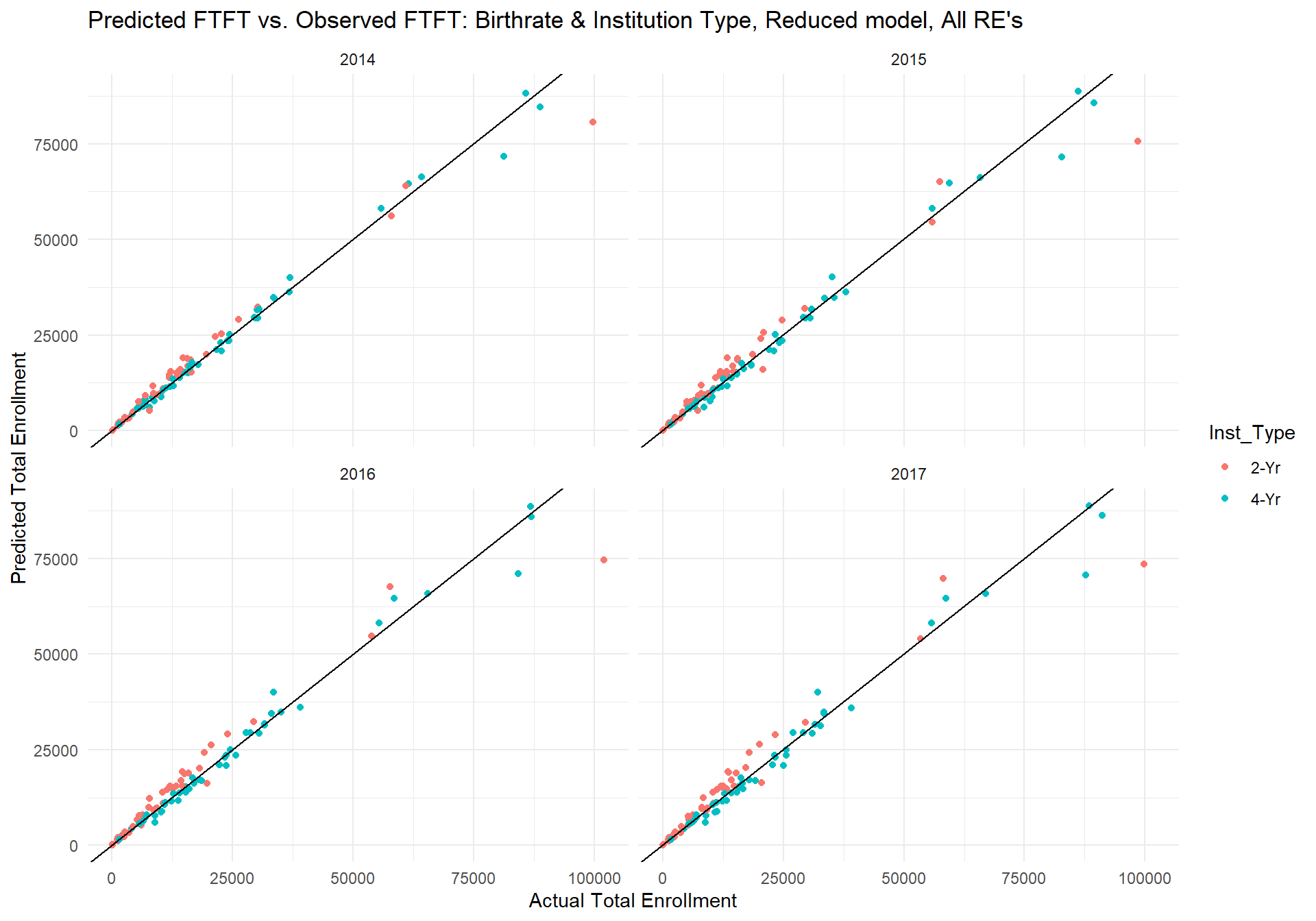 The table below shows that the actual fit of this model is slightly worse than the model's performance on total students. While the range of the model's error seems smaller, the percent error for first time (full time) students is about 3% points higher than the model's percent error on total students. Still, the correlation between the model's predicted first time student counts and actual first time student counts is very high, and in conjunction with the median and mean error suggests good model fit.
#Descriptives on reduced model
RedModFTFT_desc <- as.data.frame(cor(m.FTFT_pred$m.FTFT_predvals, m.FTFT_pred$FTFT_sum))

options(scipen = 999)
RedModFTFT_desc %>%
  rename(PredVsActual_Correlation = `cor(m.FTFT_pred$m.FTFT_predvals, m.FTFT_pred$FTFT_sum)`) %>%
  mutate(min_error =  min(m.FTFT_pred$m.FTFT_error),
         median_error =  median(m.FTFT_pred$m.FTFT_error),
         mean_error = mean(m.FTFT_pred$m.FTFT_error),
         max_error = max(m.FTFT_pred$m.FTFT_error),
         percent_error = sum(abs(m.FTFT_pred$m.FTFT_error))/sum(m.FTFT_pred$FTFT_sum)) %>%
  gather(1:6, key = "Fit Index", value = "Value")
## Fit Index Value
## 1 PredVsActual_Correlation 0.98564455
## 2 min_error -27440.61967891
## 3 median_error 335.08160230
## 4 mean_error 314.24039428
## 5 max_error 11525.51518988
## 6 percent_error 0.09836766Model Predictions
 #All Years FTFT
AllYearsFTFTPred <- df.future_st_allYears %>%
  mutate(AllYearsFTFTPredvals = exp(predict(m.FTFT, newdata = df.future_st_allYears, allow.new.levels = TRUE,
                                    re.form = ~(1 + Inst_Type | State))))

AllYearsFTFTPredPlot <- AllYearsFTFTPred %>%
  group_by(Year, Inst_Type) %>%
  mutate(TotalFTFTEnrollment_pred = sum(AllYearsFTFTPredvals)) %>%
  select(Year, Inst_Type, TotalFTFTEnrollment_pred) %>%
  unique() %>%
  mutate(modelyears = ifelse(Year < 2018, "Known Enrollment", "Unknown Enrollment")) %>%
  filter(Inst_Type == "4-Yr") %>%
  ggplot(aes(x = Year, y = TotalFTFTEnrollment_pred, color = modelyears)) + geom_point() + geom_line() +
  ggtitle("Predicted FTFT Enrollment: 2008 - 2035") + theme_minimal() + ylab("Predicted FTFT Enrollment") + xlab("") +
  scale_x_continuous(breaks = seq(2008,2035,1), limits =c(2008,2035)) +
  theme(axis.text.x = element_text(angle = 70, hjust = 1, face = "bold"))


ggarrange(birthplot,AllYearsFTFTPredPlot, ncol = 1, nrow = 2)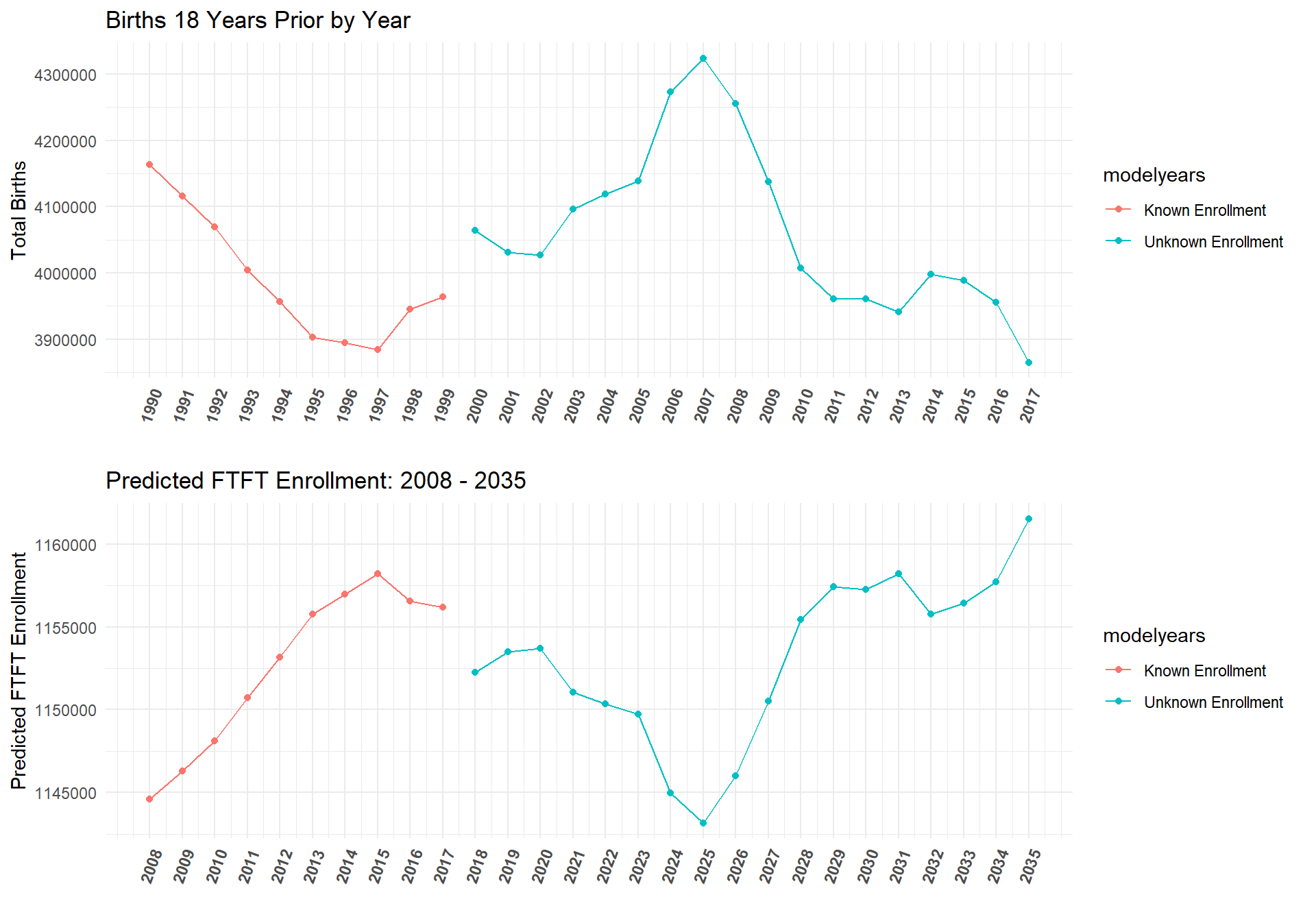
Total students model vs. First time full time model
To better understand the differences in the Reduced Model's performance between total student counts and first time student counts, we investigated the errors as a ratio of actual data and for each student type.
m_compare_FT_TS <- m_2_pred %>% #boxplot
left_join(m.FTFT_pred %>% select(Year,State,Inst_Type,m.FTFT_erroratio)) %>%
select(Year, Inst_Type,State, m_2_predvals, m.FTFT_erroratio,TS_st) %>%
mutate(mTS_error_ratio = (m_2_predvals - TS_st)/TS_st) %>%
gather(mTS_error_ratio, m.FTFT_erroratio, key = "model", value = "error_ratio") %>%
ggplot(aes(x = error_ratio, color = model, group = model, fill = model, alpha = 0.5, linetype = model)) +
geom_density() + geom_vline(xintercept = 0) +xlab("Error as a Ratio of Observed Data") +
ggtitle("Density plot of error ratio for best model on total students and FTFT") +
scale_fill_manual(values = c("green", "purple")) +
scale_colour_manual(values = c("white", "purple")) +
facet_wrap(~Inst_Type) + theme_minimal() +
theme(legend.position = "none")
m_compare_FT_TS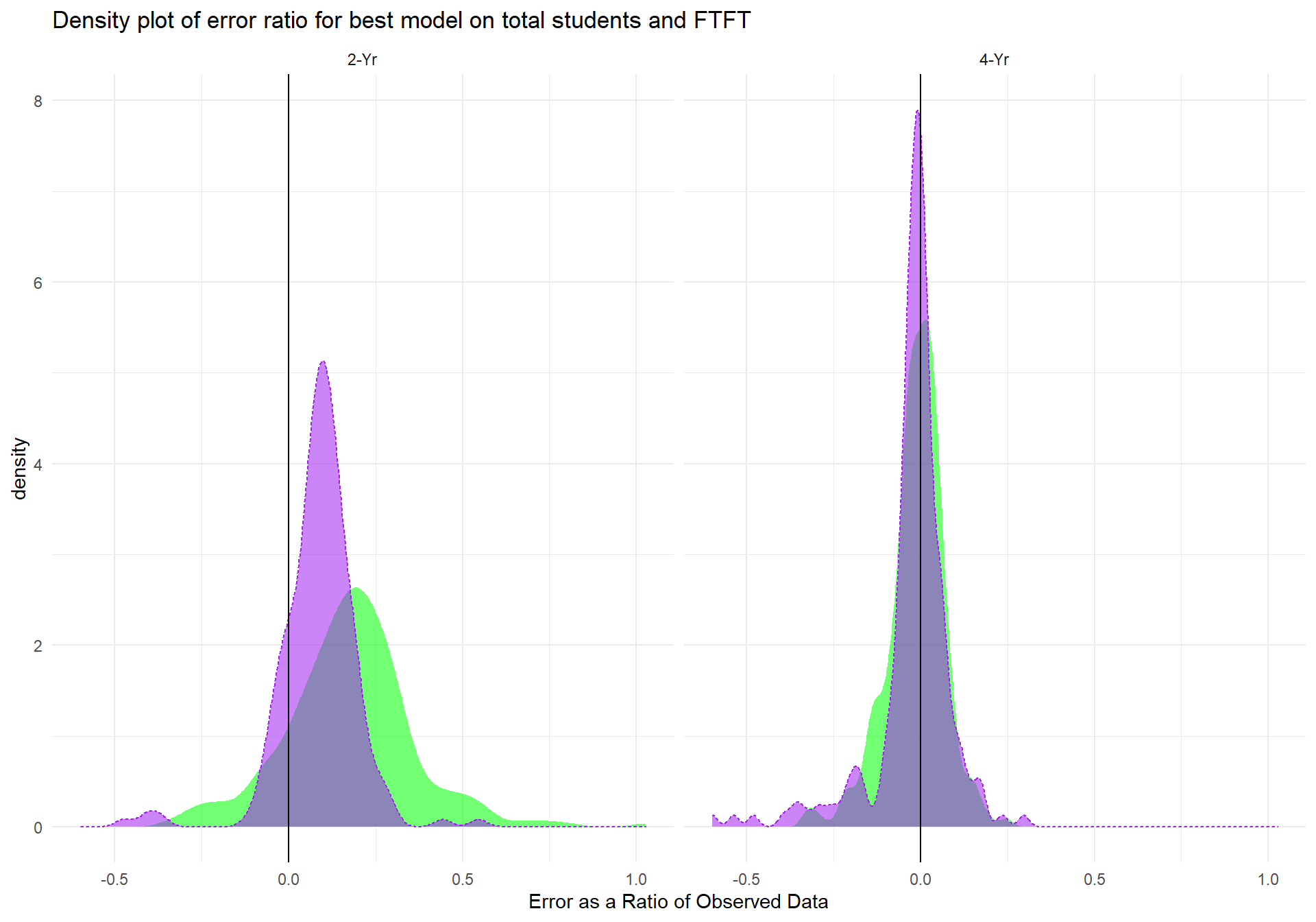 The area in green represents the distribution of error ratios for the first time student model, where the purple indicates the distribution of error ratios for the total student model. The largest differences between the two models is for 2-Yr institutions, where the total student model performs much better (albeit it's performance for 2-Yr instiutioins is also its worst). For the other 3 institution types, the models are similar, but it can be seen that the total student model outperforms the first time student model in all cases.
Conclusions
This report highlights the advantages of regression methods that value parsimony. The final models used to estimate both total student counts and first time student counts are extremely simple relative to the complexity of other models of future college enrollment(i.e., HEDI model by Nathan Grawe). These models also suggest that just knowing the birth count of a state is highly predictive of college enrollment 18 years later. However, as most readers will have figured out from the future prediction graphs, the model estimates the relationship between birthrate and college student counts as an inverse relationship. This is not due to a data error on our part. Rather, the true relationship between college head counts in 2008-2013 were indeed negatively related to birth rates 18 years prior. Since the model was trained on this data, this is what the model expects. It is difficult to know if this inverse relationship reflects the true relationship between birth rate and college enrollment or if such a relationship only existed for the years 2008-2013. We can say, that at least for 2014-2017, the relationship does hold up as evidenced by our models' high fit performance for these years. If the relationship were to change, the models above could account for such changes through an interaction with either the year at the time of recording student counts or the year that is equal to 18 years prior. In this case, the interaction would allow the relationship between birth rate counts and college student counts to fluctuate, but much more student and birth rate data would be necessary to establish such an interaction.
While it will take more time to identify if the relationship between birth rate and college going 18 years later is a stable inverse relationship, this report demonstrate that our modeling techniques and methods worked quite well. Should the relationship between birth rate change to positive but still hold the same underlying consistency, we would expect our exact model to still perform exceedingly well.
Of course, there is still room for improvement in both models, particularly for 2-Year institutions whose enrollment counts are likely driven by other important variables not accounted for in the models reported here. Furthermore, as shown earlier, each model still overestimates or underestimates by quite a few thousand students. It is likely that including other variables (e.g., measures of economic activity) may help tighten the above models' predictions.
References
Raudenbush, Stephen W., and Anthony S. Bryk. Hierarchical linear models: Applications and data analysis methods. Vol. 1(2nd Ed.). Sage, 2002.