Layers
ggplot2 is a plotting package that uses various layers to depict data. It is important to remember that the plot is actually made of layers. This can be easy to forget for someone who has just begun to code and relies on the defaults within ggplot. While these defaults are extremely useful, the true sandbox of creativty lies within manual layer input. While I still have much more to learn and am far from a master of layer techniques, this report will share what I have learned so far.
For data, I will simply use an x and a y which are both 100 samples taken from a randomized normal distribution.
set.seed(09870987)
# Here is our data set
df <- as.data.frame(rnorm(100))
df <- df %>%
  rename(x = `rnorm(100)`) %>%
  mutate(y = rnorm(100))
Scatter Plots
Scatter plots use the geom_point() function from ggplot2. This function creates a layer that adds a shape at the coordinates of each data point. In this case, the coordinates for each data point are (x,y). Normally, someone new to ggplot will just use the default shape, or if they change the default shape, they will still use only one geom_point() layer. If you layer, or stack these geoms, you can create unique shapes that add an extra flare to your aesthetics.
Basic Default Plot
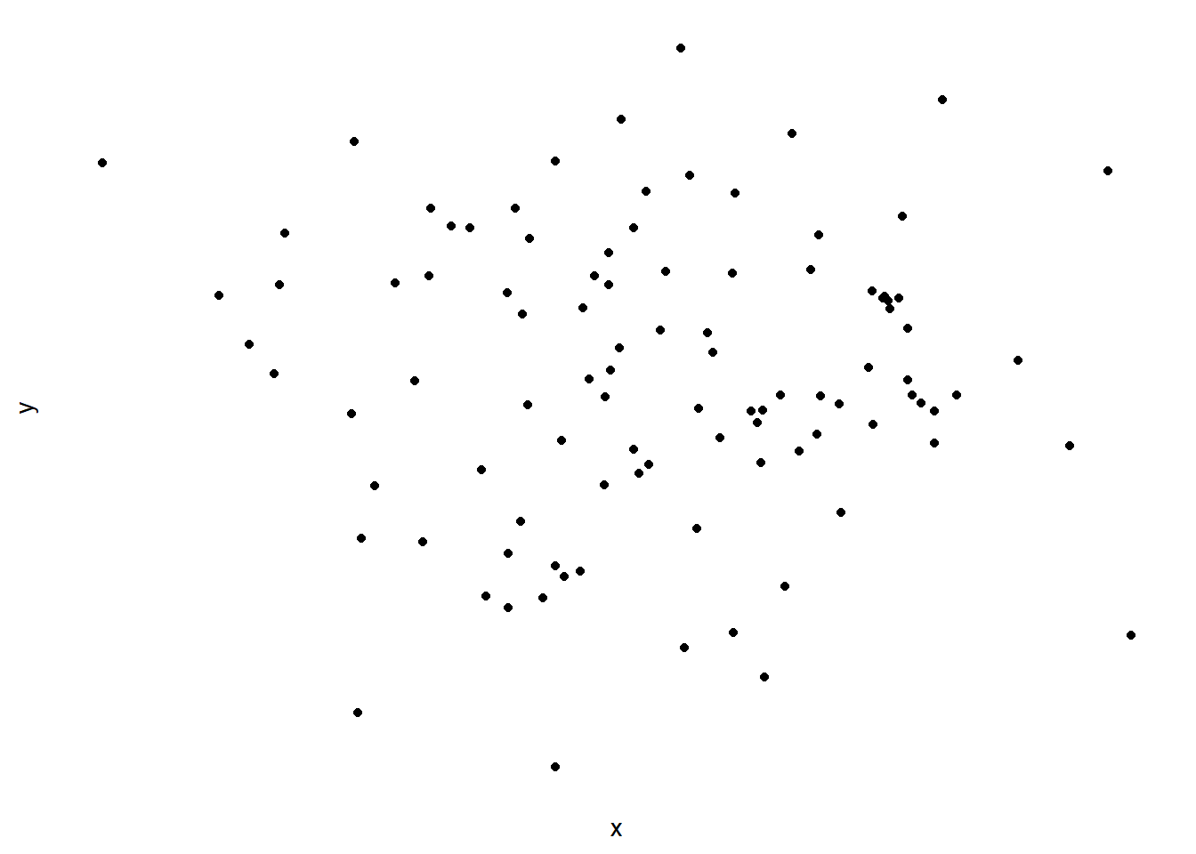
Below is a very basic scatter plot with no background, axis ticks, axis text, or grid lines. This scatter plot shows the default geom for geom_point().
#Make a very basic plot, with no layers except the axis labels and geoms
df %>%
  ggplot(aes(x = x, y = y)) +
  geom_point() +
  theme(
    axis.text = element_blank(),
    axis.line = element_blank(),
    axis.ticks = element_blank(),
    panel.background = element_blank(),
    panel.spacing = element_blank(),
    panel.border = element_blank(),
    panel.grid = element_blank()

  )
Diamond Plot
Here, we show the same plot as above but we have now changed the shape of the geoms, and included two layers. Notice in the code how you must specify the geom_point() layers in the correct order for the shape you would like to generate.
This neat combo of geoms produces a sort of diamond like figure.
#Ichi (Diamonds are Forever)
size1 <- 4
size2 <- size1*0.20
df %>%
  ggplot(aes(x = x, y = y)) +
  geom_point(color="black", size=size1, shape = 18) +
  geom_point(color="white", size =size2, shape = 16) +
  theme(
    axis.text = element_blank(),
    axis.line = element_blank(),
    axis.ticks = element_blank(),
    panel.background = element_blank(),
    panel.spacing = element_blank(),
    panel.border = element_blank(),
    panel.grid = element_blank()

) 
Minesweeper
This plot uses three geom_point() layers to develop something that reminded me of the oldschool mines in minesweeper.
#Ni (Minesweeper)
size1 <- 4
size2 <- size1*0.2
df %>%
  ggplot(aes(x = x, y = y)) +
  geom_point(color="black", size=size1, shape = 18) +
  geom_point(color="black", size=size1, shape = 8) +
  geom_point(color="white", size =size2, shape = 16) +
  theme(
    axis.text = element_blank(),
    axis.line = element_blank(),
    axis.ticks = element_blank(),
    panel.background = element_blank(),
    panel.spacing = element_blank(),
    panel.border = element_blank(),
    panel.grid = element_blank()

) 
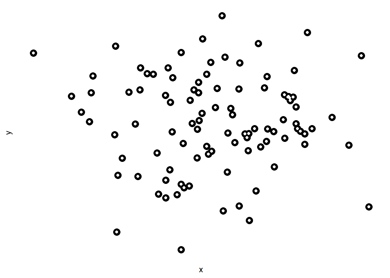
Undercut Trendy
#San (Undercut Trendy
size1 <- 4
size2 <- size1*0.35
df %>%
  ggplot(aes(x = x, y = y)) +
  geom_point(color="black", size=size1, shape = 16) +
  geom_point(color="white", size =size2, shape = 16) +
  theme(
    axis.text = element_blank(),
    axis.line = element_blank(),
    axis.ticks = element_blank(),
    panel.background = element_blank(),
    panel.spacing = element_blank(),
    panel.border = element_blank(),
    panel.grid = element_blank()

) 
Eyeballs
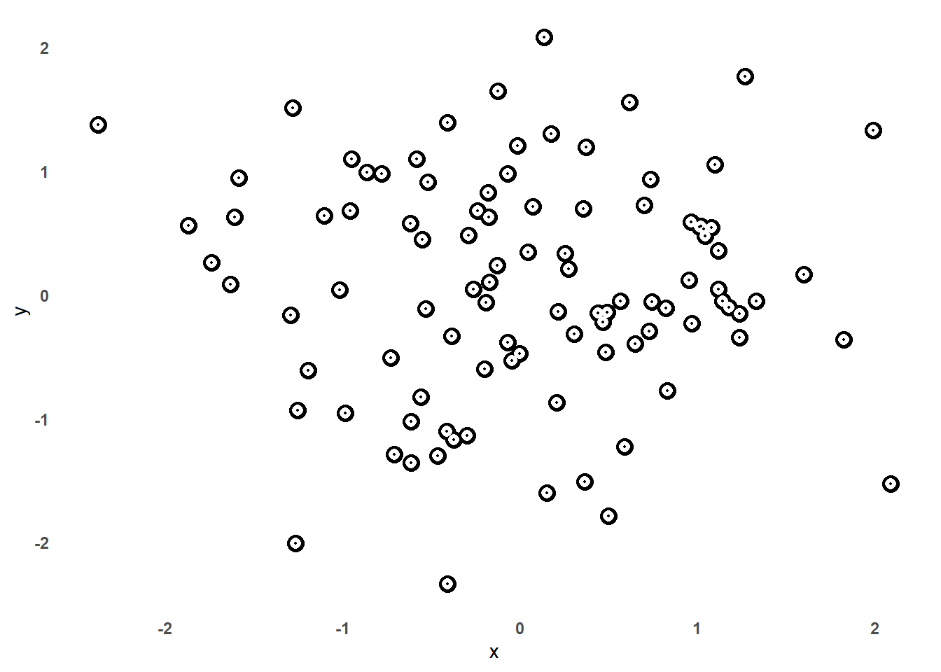
One of my personal favorites! This reminded me of little eyeballs and they come out with a neat and clean look to them.
#Yon (eyeballs)
size1 <- 4
size2 <- size1*0.6
size3 <- size1*0.077

xint_min <- round(min(df$x),0)
xint_max <- round(max(df$x),0)
yint_min <- round(min(df$y),0)
yint_max <- round(max(df$y),0)

df %>%
  ggplot(aes(x = x, y = y)) +
  # geom_hline(yintercept = seq(yint_min,yint_max,0.2), linetype = "dashed", color = "grey90") +
  # geom_vline(xintercept = seq(xint_min,xint_max,0.2), linetype = "dashed", color = "grey90") +
  # geom_hline(yintercept = seq(-3,3,0.4), linetype = "dashed", color = "grey70") +
  # geom_vline(xintercept = seq(-4,2.8,0.4), linetype = "dashed", color = "grey70") +
  # geom_vline(xintercept = 0, linetype = "dashed", color = "grey50") +
  # geom_hline(yintercept = 0, linetype = "dashed", color = "grey50")+
  geom_point(color="black", size=size1, shape = 16) +
  geom_point(color="white", size =size2, shape = 16) +
  geom_point(color="black", size=size3, shape = 16) +
  theme(
    axis.text = element_text(face = "bold"),
    axis.line = element_blank(),
    axis.ticks = element_blank(),
    panel.background = element_blank(),
    panel.spacing = element_blank(),
    panel.border = element_blank(),
    panel.grid = element_blank()
) 
  # scale_y_continuous(breaks = seq(yint_min,yint_max,0.4)) +
  # scale_x_continuous(breaks = seq(xint_min,xint_max,0.4))
Dragon Balls
#Yon (eyeballs)
size1 <- 4
size2 <- size1*0.6
size3 <- size1*0.8


df %>%
  ggplot(aes(x = x, y = y)) +
  geom_point(color="black", size=size1, shape = 16) +
  geom_point(color="white", size =size2, shape = 16) +
  geom_point(color="black", size=size3, shape = 42) +
  theme(
    axis.text = element_text(face = "bold"),
    axis.line = element_blank(),
    axis.ticks = element_blank(),
    panel.background = element_blank(),
    panel.spacing = element_blank(),
    panel.border = element_blank(),
    panel.grid = element_blank()
) 
Obon Festival
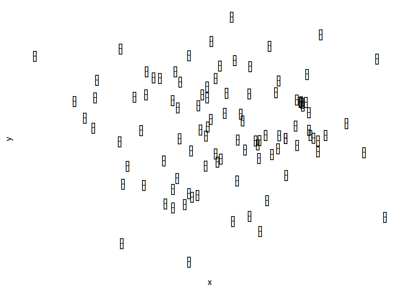
This plot adds a unique element of lift to each point. It reminds me of the Obon Festival celebrated in Japan, where paper lanterns are set out as an invitation for the spirits of one's ancestors to return home.
size1 <- 6.7
size2 <- size1
df %>%
  ggplot(aes(x = x, y = y)) +
  geom_point(color="black", size=size1, shape = 127) +
  geom_point(color="white", size =size2, shape = 95) +
  theme(
    axis.text = element_blank(),
    axis.line = element_blank(),
    axis.ticks = element_blank(),
    panel.background = element_blank(),
    panel.spacing = element_blank(),
    panel.border = element_blank(),
    panel.grid = element_blank()

) 
Obon Festival v2
size1 <- 6.7
size2 <- size1*0.3
df %>%
  ggplot(aes(x = x, y = y)) +
  geom_point(color="black", size=size1, shape = 127) +
  geom_point(color="black", size=size2, shape = 95) +
  theme(
    axis.text = element_blank(),
    axis.line = element_blank(),
    axis.ticks = element_blank(),
    panel.background = element_blank(),
    panel.spacing = element_blank(),
    panel.border = element_blank(),
    panel.grid = element_blank()

) 
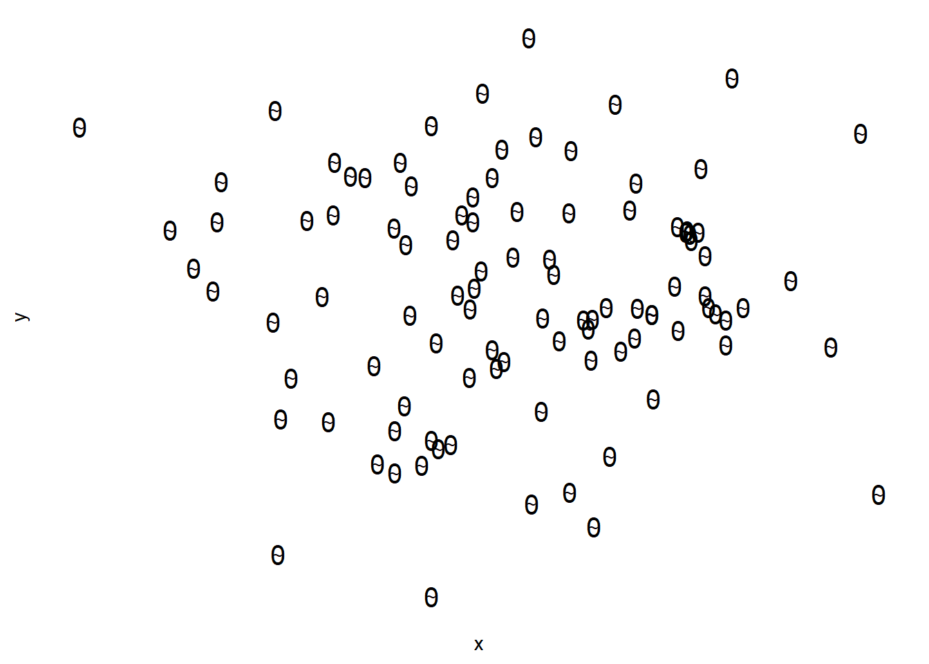
Dinosaur Eggs
size1 <- 5
size2 <- size1*0.6
df %>%
  ggplot(aes(x = x, y = y)) +
  geom_point(color="black", size=size1, shape = 48) +
  geom_point(color="black", size=size2, shape = 126) +
  theme(
    axis.text = element_blank(),
    axis.line = element_blank(),
    axis.ticks = element_blank(),
    panel.background = element_blank(),
    panel.spacing = element_blank(),
    panel.border = element_blank(),
    panel.grid = element_blank()

) 
Capsules
size1 <- 5
size2 <- size1*0.6
df %>%
  ggplot(aes(x = x, y = y)) +
  geom_point(color="black", size=size1, shape = 48) +
  geom_point(color="black", size=size2, shape = 95) +
  theme(
    axis.text = element_blank(),
    axis.line = element_blank(),
    axis.ticks = element_blank(),
    panel.background = element_blank(),
    panel.spacing = element_blank(),
    panel.border = element_blank(),
    panel.grid = element_blank()

) 
Backgrounds
The examples above show just how many different unique combinations you can make with different geom_point layers. Now, I will provide some examples of how layers are also useful for the background of a plot, and how you can add custom grid lines to your graphs.
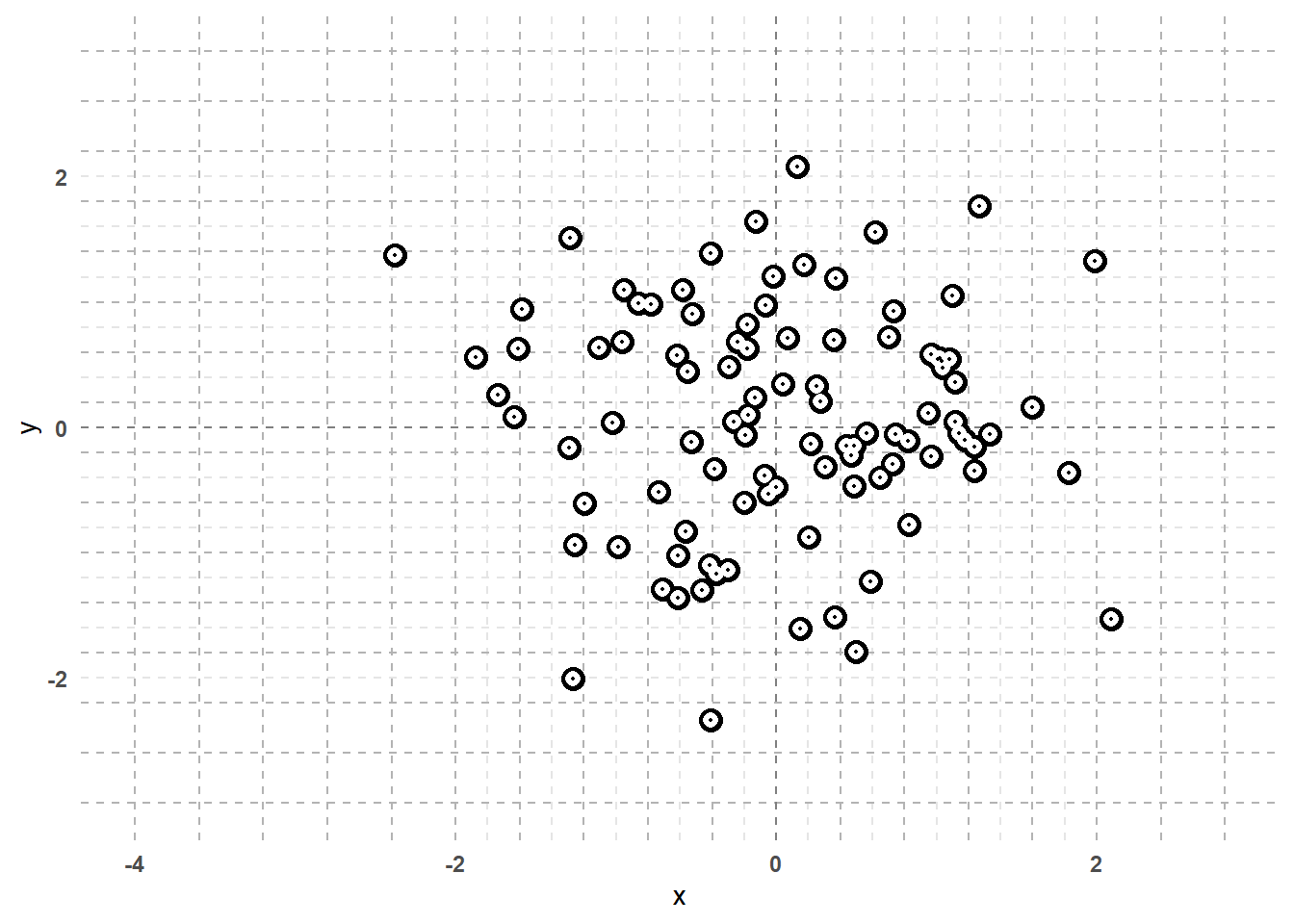
Grid Paper
For starters, I'll use my personal favorite from the graphs above: the eyeballs plot. This background style is meant to mimic dotted/dashed grid paper. Note that the grid is made with a combination of geom_hline() and geom_vline(). Also note the use of the seq() function. This makes it much easier to have the horizontal and vertical lines spaced where we want them without having to manually enter a geom_hline() or geom_vline() for each line we want.
#Yon (eyeballs)
size1 <- 4
size2 <- size1*0.6
size3 <- size1*0.077

xint_min <- round(min(df$x),0)
xint_max <- round(max(df$x),0)
yint_min <- round(min(df$y),0)
yint_max <- round(max(df$y),0)

df %>%
  ggplot(aes(x = x, y = y)) +
  geom_hline(yintercept = seq(yint_min,yint_max,0.2), linetype = "dashed", color = "grey90") +
  geom_vline(xintercept = seq(xint_min,xint_max,0.2), linetype = "dashed", color = "grey90") +
  geom_hline(yintercept = seq(-3,3,0.4), linetype = "dashed", color = "grey70") +
  geom_vline(xintercept = seq(-4,2.8,0.4), linetype = "dashed", color = "grey70") +
  geom_vline(xintercept = 0, linetype = "dashed", color = "grey50") +
  geom_hline(yintercept = 0, linetype = "dashed", color = "grey50")+
  geom_point(color="black", size=size1, shape = 16) +
  geom_point(color="white", size =size2, shape = 16) +
  geom_point(color="black", size=size3, shape = 16) +
  theme(
    axis.text = element_text(face = "bold"),
    axis.line = element_blank(),
    axis.ticks = element_blank(),
    panel.background = element_blank(),
    panel.spacing = element_blank(),
    panel.border = element_blank(),
    panel.grid = element_blank()
) 
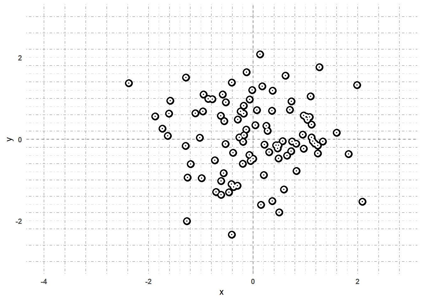
Here's the same plot above, but now with a different linetype for the background grid.
#Yon (eyeballs)
size1 <- 4
size2 <- size1*0.6
size3 <- size1*0.077

xint_min <- round(min(df$x),0)
xint_max <- round(max(df$x),0)
yint_min <- round(min(df$y),0)
yint_max <- round(max(df$y),0)

df %>%
  ggplot(aes(x = x, y = y)) +
  geom_hline(yintercept = seq(yint_min,yint_max,0.2), linetype = "dotdash", color = "grey90") +
  geom_vline(xintercept = seq(xint_min,xint_max,0.2), linetype = "dotdash", color = "grey90") +
  geom_hline(yintercept = seq(-3,3,0.4), linetype = "dotdash", color = "grey70") +
  geom_vline(xintercept = seq(-4,2.8,0.4), linetype = "dotdash", color = "grey70") +
  geom_vline(xintercept = 0, linetype = "dashed", color = "grey50") +
  geom_hline(yintercept = 0, linetype = "dashed", color = "grey50")+
  geom_point(color="black", size=size1, shape = 16) +
  geom_point(color="white", size =size2, shape = 16) +
  geom_point(color="black", size=size3, shape = 16) +
  theme(
    axis.text = element_text(face = "bold"),
    axis.line = element_blank(),
    axis.ticks = element_blank(),
    panel.background = element_blank(),
    panel.spacing = element_blank(),
    panel.border = element_blank(),
    panel.grid = element_blank()
) 
Conclusions
I sincerely hope that the examples above are useful to those who are interested in ggplot. I also hope that this post brings up the importance of layer orders as well as the amount of creativity that lies within the ggplot's layer framework. Please play around and don't be shy to share your own creations!